
WIRED
Banner ADS
Wired is one of the oldest publications that delivers vital news about the tech industry. They have changed with the times, but they stay true to the medium that grew their brand the most, print media.
Here, I will show how applying UX principles can positively affect the performance of these banners and the thinking it takes to create digital media that affects users.

ROLE
Senior Designer
CONTRIBUTIONS
Design, ideation, concept, layout
DELIVERABLES
Design, concepts, animation, banners
APPLICATIONS

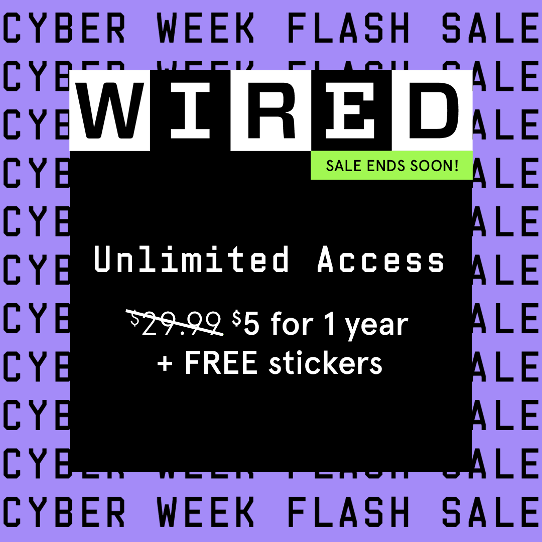
CYBER WEEK BRIEF
For Cyber Week, which coincided with Black Friday, Wired wanted to notify potential users about the discount they offer for subscriptions: $5 for 1 Year, plus free stickers. This is a really good deal considering the original subscription is $29.99 a month. We had pretty much free rein to use their branding materials as long as they were legible.
APPROACH
Given that we could use the branding materials anyway we could, I focus mostly on structure and user experience. First, I wanted to show variation. So I constructed banners that focused on a variety of topics. Politics, Tech, Culture. Casting a bit of a wide net could help to bring in new users this far down the funnel.
Then I thought about how good a deal this was. So I decided to create a text-only banner that showcased the offer more prominently. I also wanted to put the name of the event in the background with motion, so the offer will maintain prominence.


RESULTS
After running for a couple of weeks, Wired sent us the performance results of our chosen banners. We decided to run the yellow and the purple, and the neon green dominant banners.
I have to admit, our team had some preconceived notions on which banners would be successful, but the ones that performed the best were the ones that were structured based on user experience.
The text-based ads worked better because they had a hook that people were interested in. Plus, the design focused more on the offer, which would be more appealing to users who are familiar with the Wired brand.
CAC: $22
CVR: .19%
CTR: .084%
CAC: $32
CVR: .14%
CTR: .086%
CAC: Customer Acquisition Cost
CVR: Conversion Rate CTR: Click-Through Rate
CONCLUSION
The final results showed that the previous designs were probably fatigued and needed some new imagery. I also believe that the structure of the ads helped with performance. The centered black card leads the users' eye to the offer and other vital information, like the sale ending soon, and communicates that the offer will allow users to gain unlimited access. The card also acts as a fake button, which makes the offer clickable. Plus, the team thought that the neon green would perform better since it was considered a best practice, but the purple seemed to be a bit more refreshing and more subdued compared to the loud green.
These numbers were significant because of what they meant when compared to previous performance. The purple creative had the lowest CAC and highest CVR and solid CTR in years. Across paid advertising, the banners drove 413 subscriptions at a $24 CAC, which was +11% more efficient than the CAC allowable. YoY, 97% more subscriptions were driven in that timeframe compared to Cyber Week in the previous year.
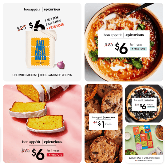
Bon Apetit / Epicurious
Banner ADS
These two information food platforms exist under the Condé Nast umbrella. They both like to showcase recipes, chefs, their knowledge, and everything food. Both brands have a long influence in the food industry, from showcasing important chefs to empowering home cooks to do more with their food.
This brand came to our agency to help them promote their offers and gain more subscribers to their publications. The great things about this brand are that a lot of people enjoy food. We should make the offers more prominent.
ROLE
Senior Designer
CONTRIBUTIONS
Design, ideation, concept, layout
DELIVERABLES
Design, concepts, animation, banners
APPLICATIONS
APPROACH
When it comes to the briefs provided by our client and account team, I always try to design for the goal at hand. Are we trying to gain more users? Is there an offer we need to communicate? Are there incentives for the target audience? If I saw this ad, why would I engage?
So in these executions, you can see that I have a central focus. Some are focused on the offer, some on focused on a gift incentive, and others are focused on the app itself.


CONCLUSION
These were launched at the client’s discretion, so our agency didn’t get a lot of insight into the performance of these banners. But one principle that I kept in mind is that to garner the best performance, I utilized different treatments. Whether it was different layouts, different item focuses, or different animations, I tried to find other practices to replace the current best practice so the brand could benefit from continuous growth.