
Joyous
Homepage redesign
Joyous offers at-home, clinician-guided low-dose ketamine therapy for depression and anxiety. The old homepage told the right story, but in a generic voice. I redesigned it around an editorial direction, built a design system to hold it together, and used Claude to get from concept to a working, responsive build in weeks.
ROLE
Creative Strategist & Designer
CONTRIBUTIONS
Art direction, design system, UI, AI build
DELIVERABLES
Responsive homepage,
design system
APPLICATIONS

APPROACH
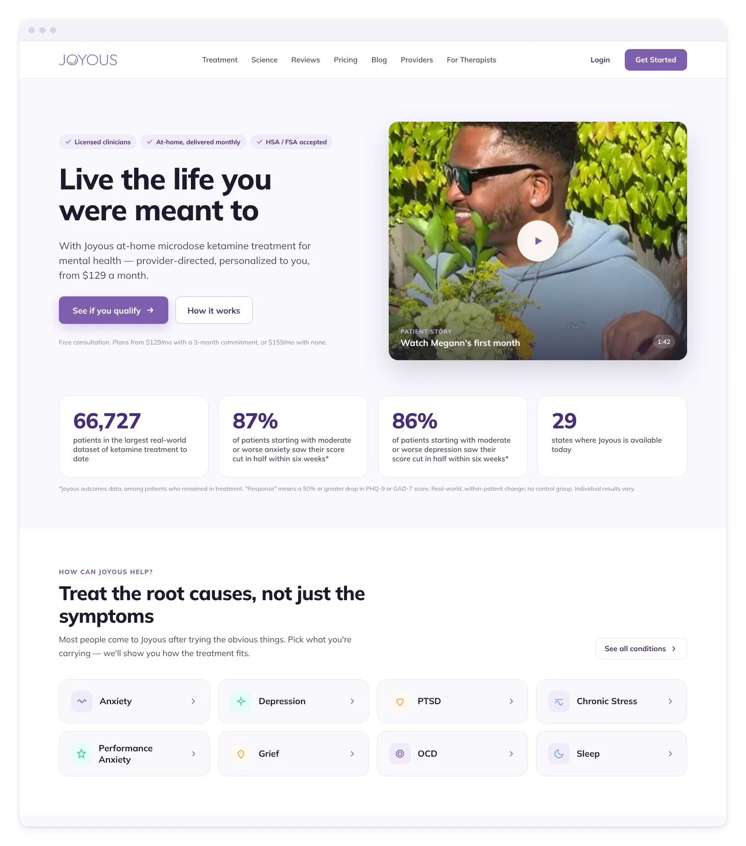
The old homepage had the right story: a real patient in the hero, a clear price, testimonials, the science and an FAQ. I kept that structure and the purple Joyous is known for. What I wanted to change was how it felt. Everything sat at the same volume: bold sans-serif headings, flat lavender panels, carousels that hid the content and little rhythm from one section to the next.
The original site
Visual study
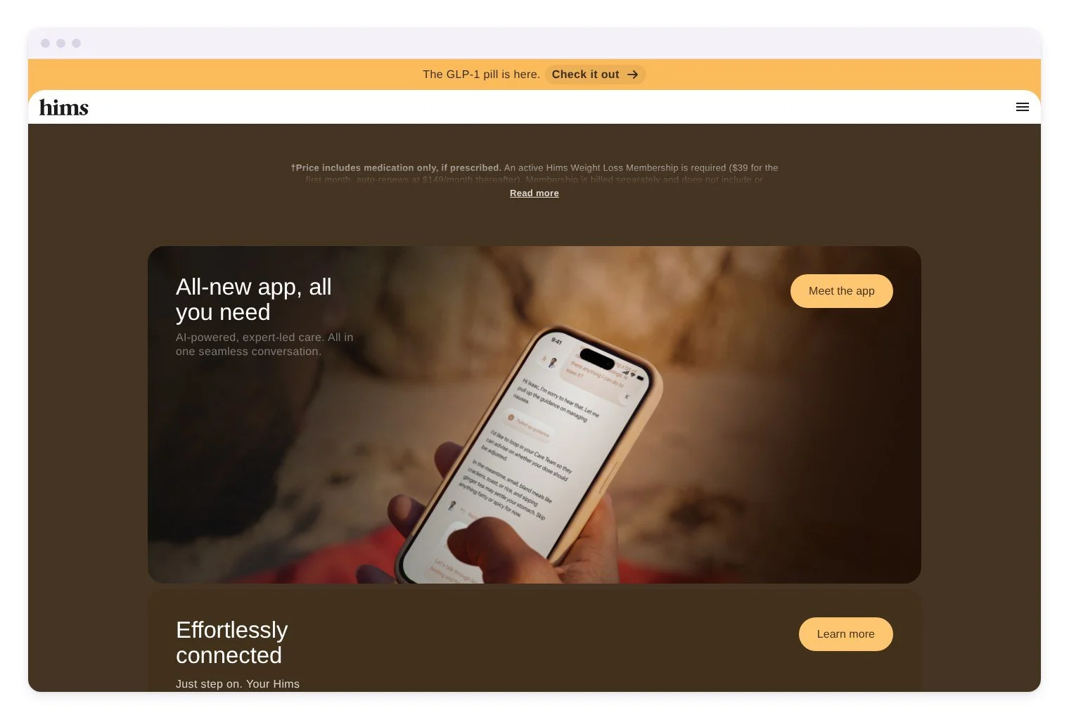
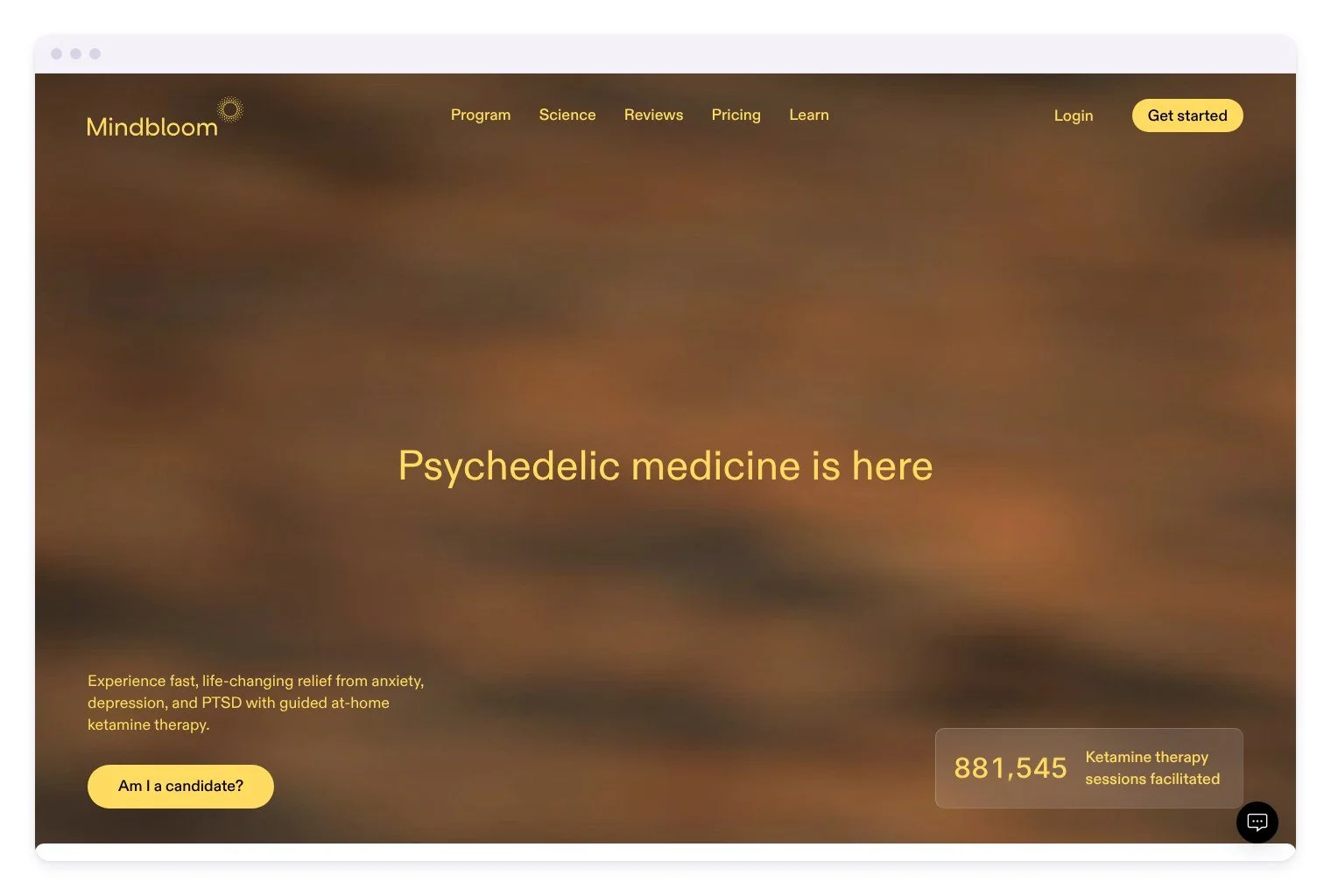
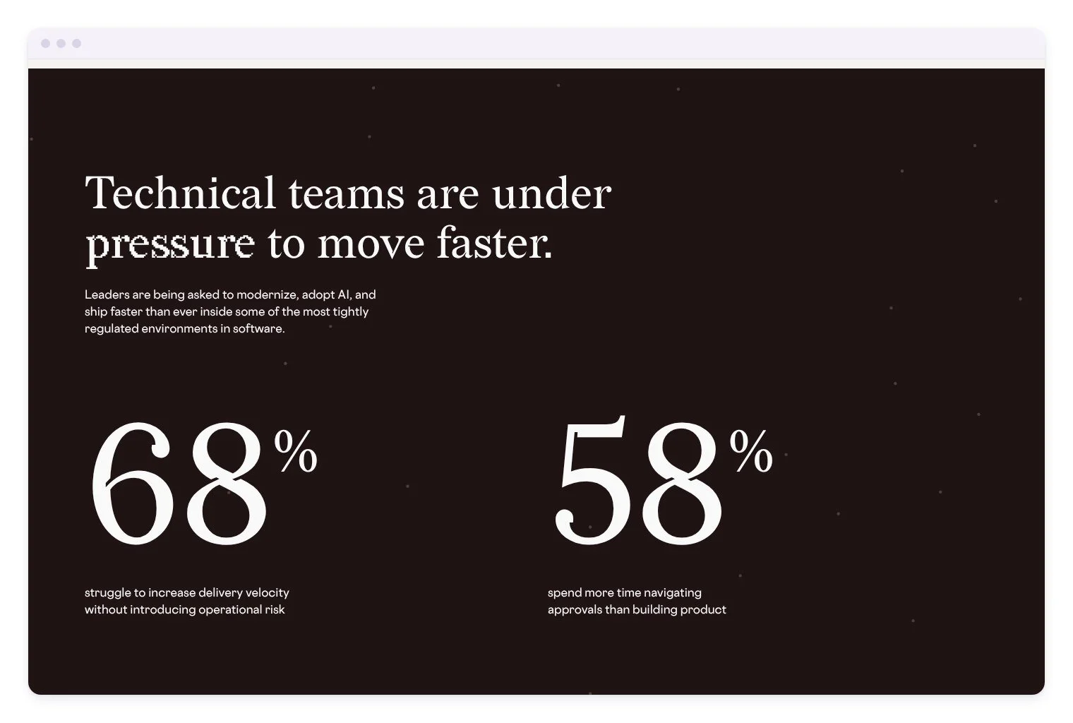
To find a new voice, I studied telehealth and studio sites that feel premium without feeling clinical. Hims leads with photography and soft pill buttons. Mindbloom pairs a warm full-bleed hero with a proof point set in glass. thoughtbot’s healthcare report lets big serif statistics carry the story, and Magma sets an editorial serif at display scale. Together they pointed toward a serif-led, photo-first homepage where the numbers do the persuading.

DESIGN SYSTEM
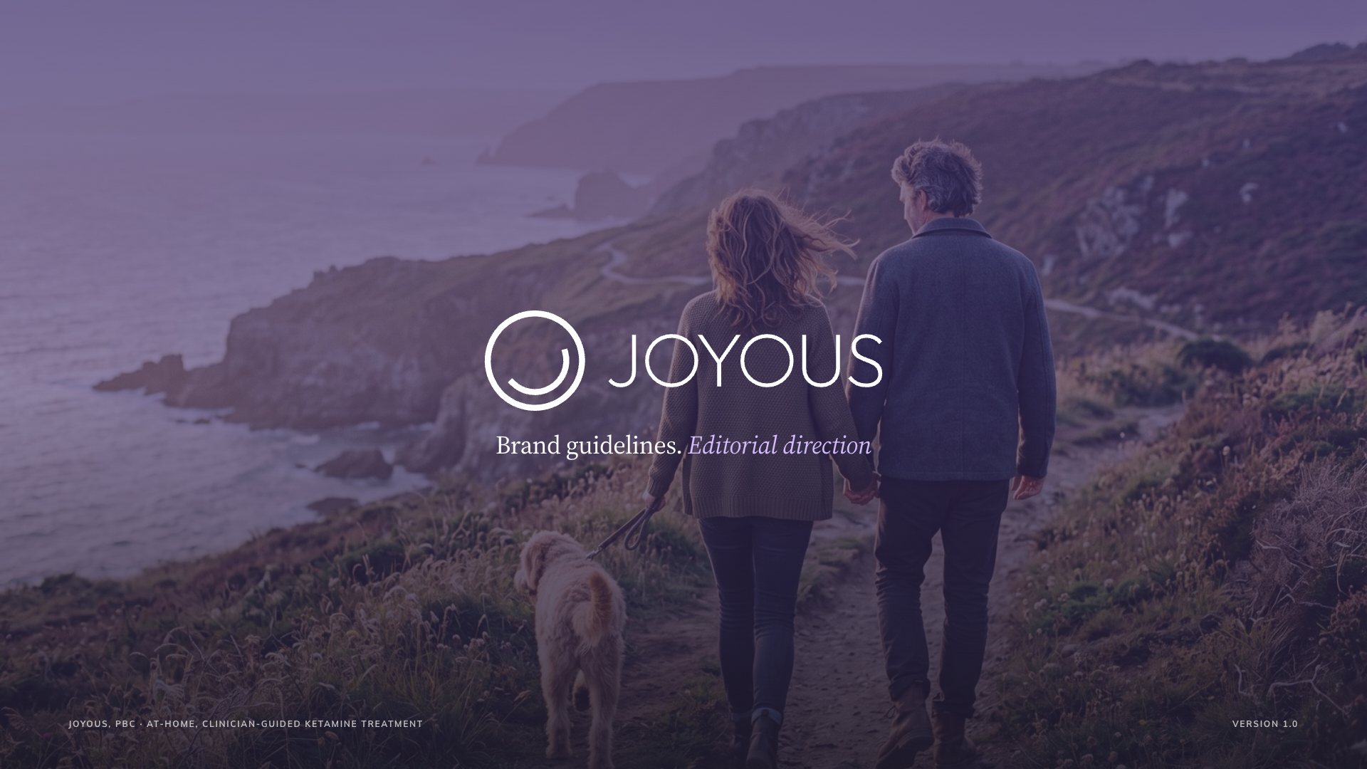
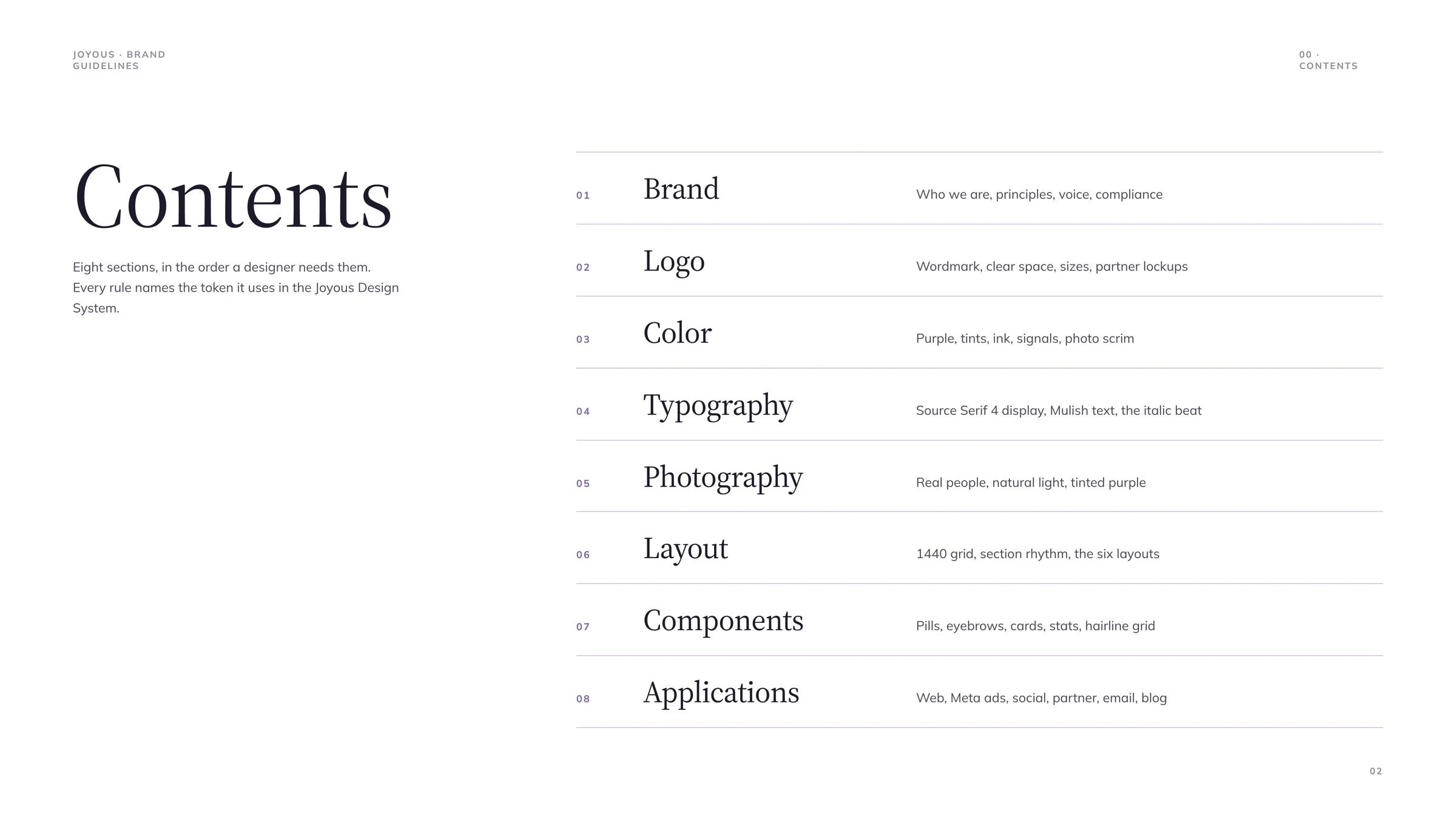
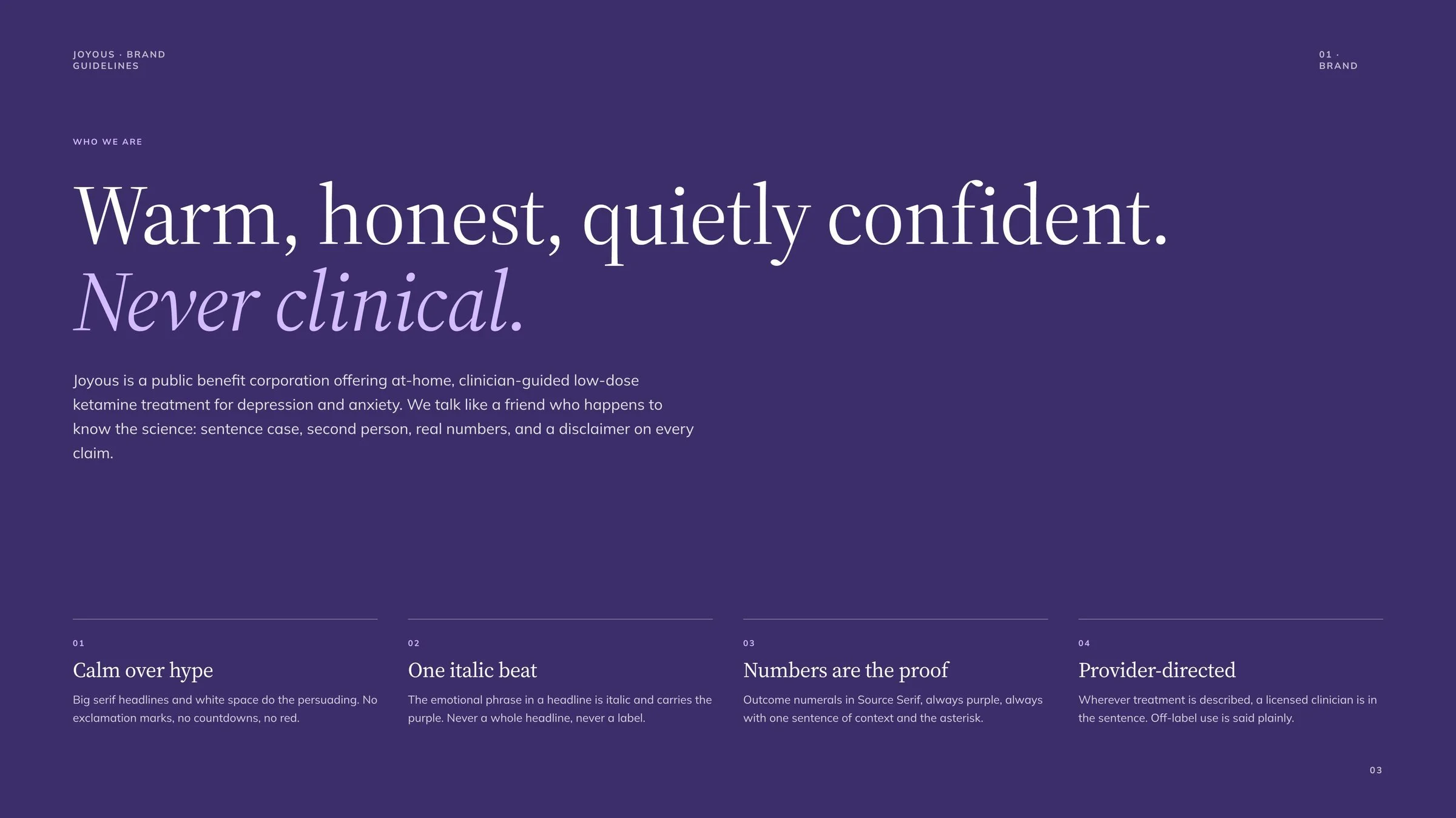
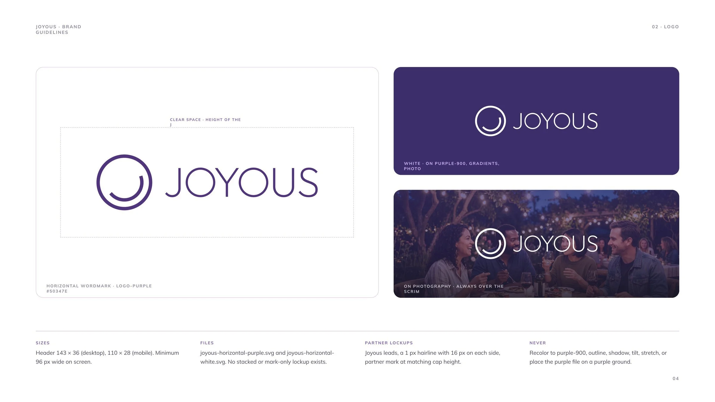
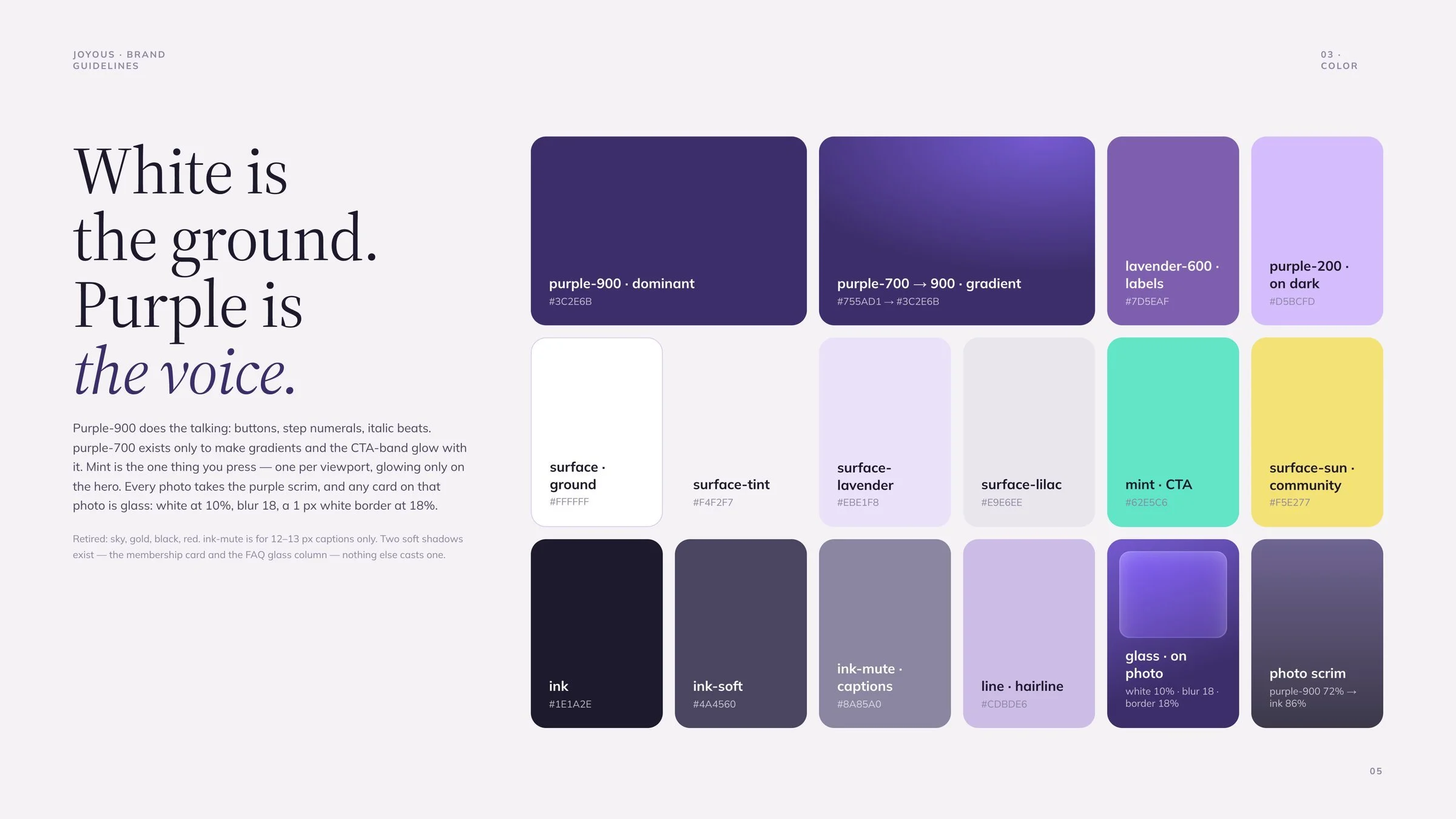
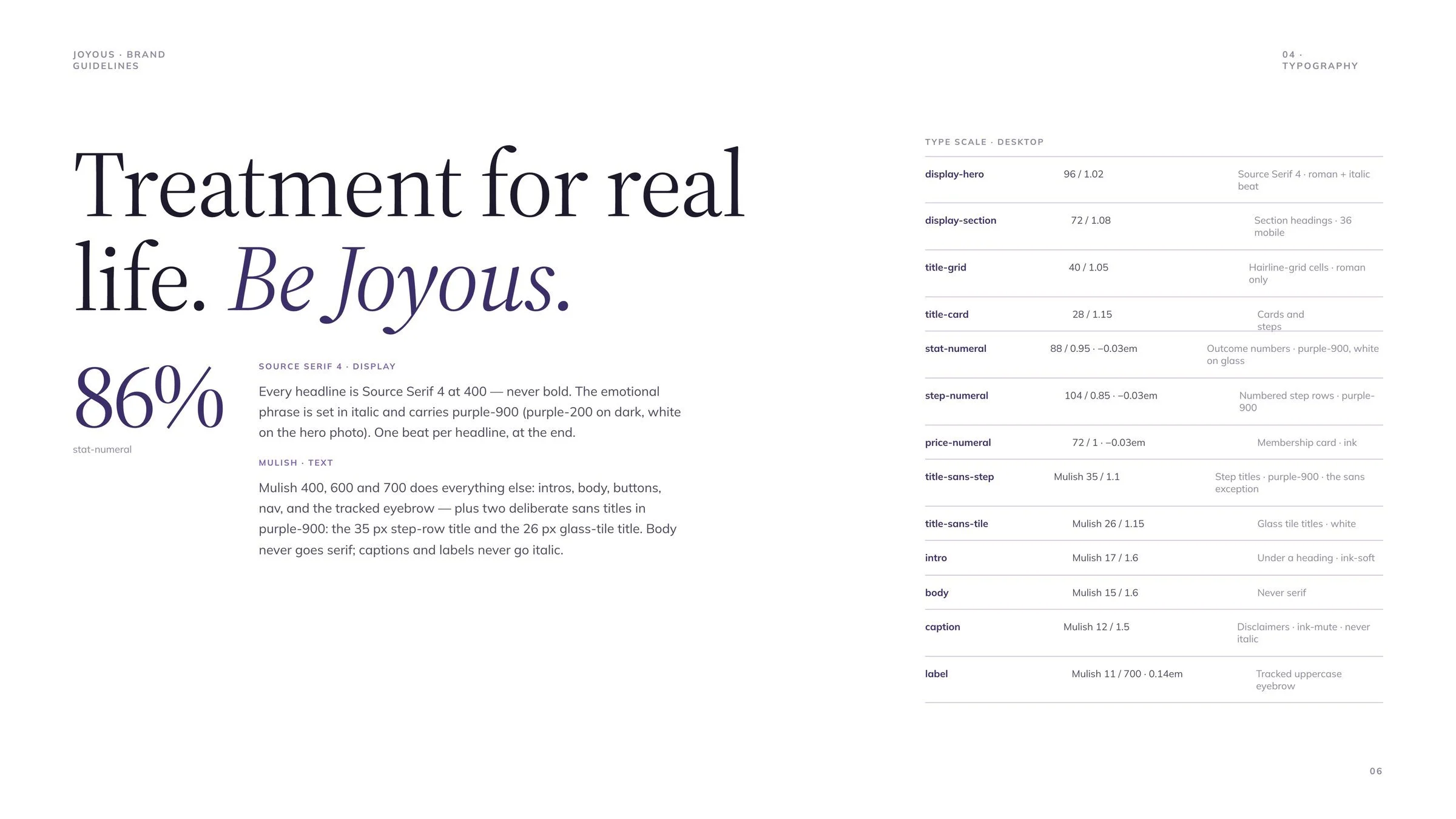
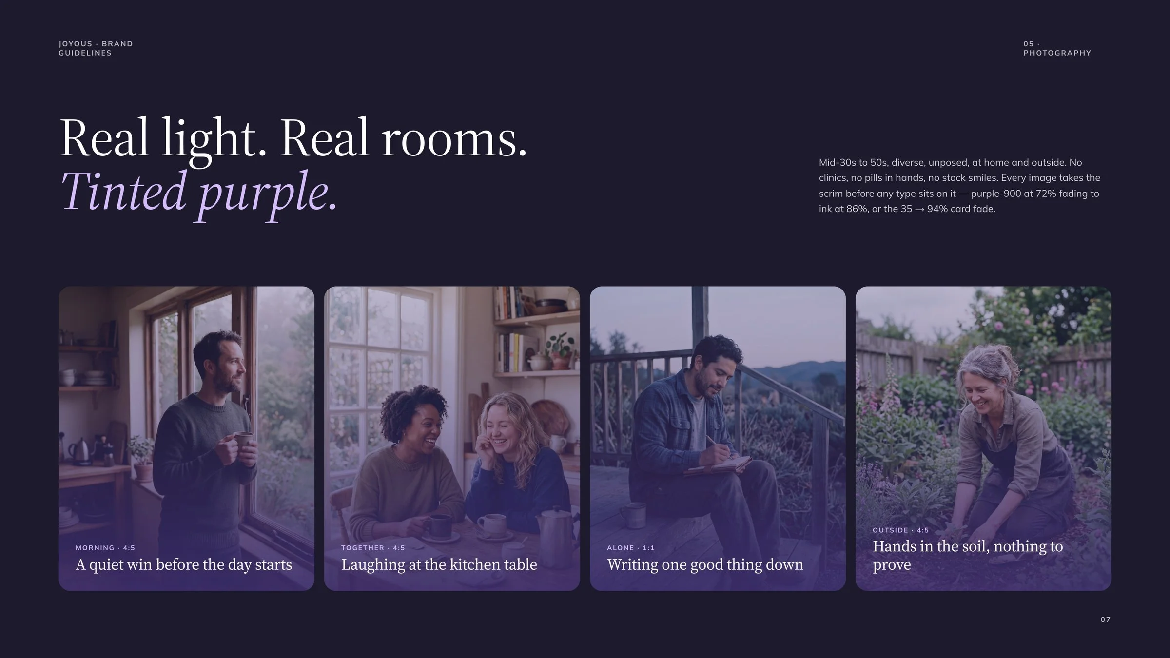
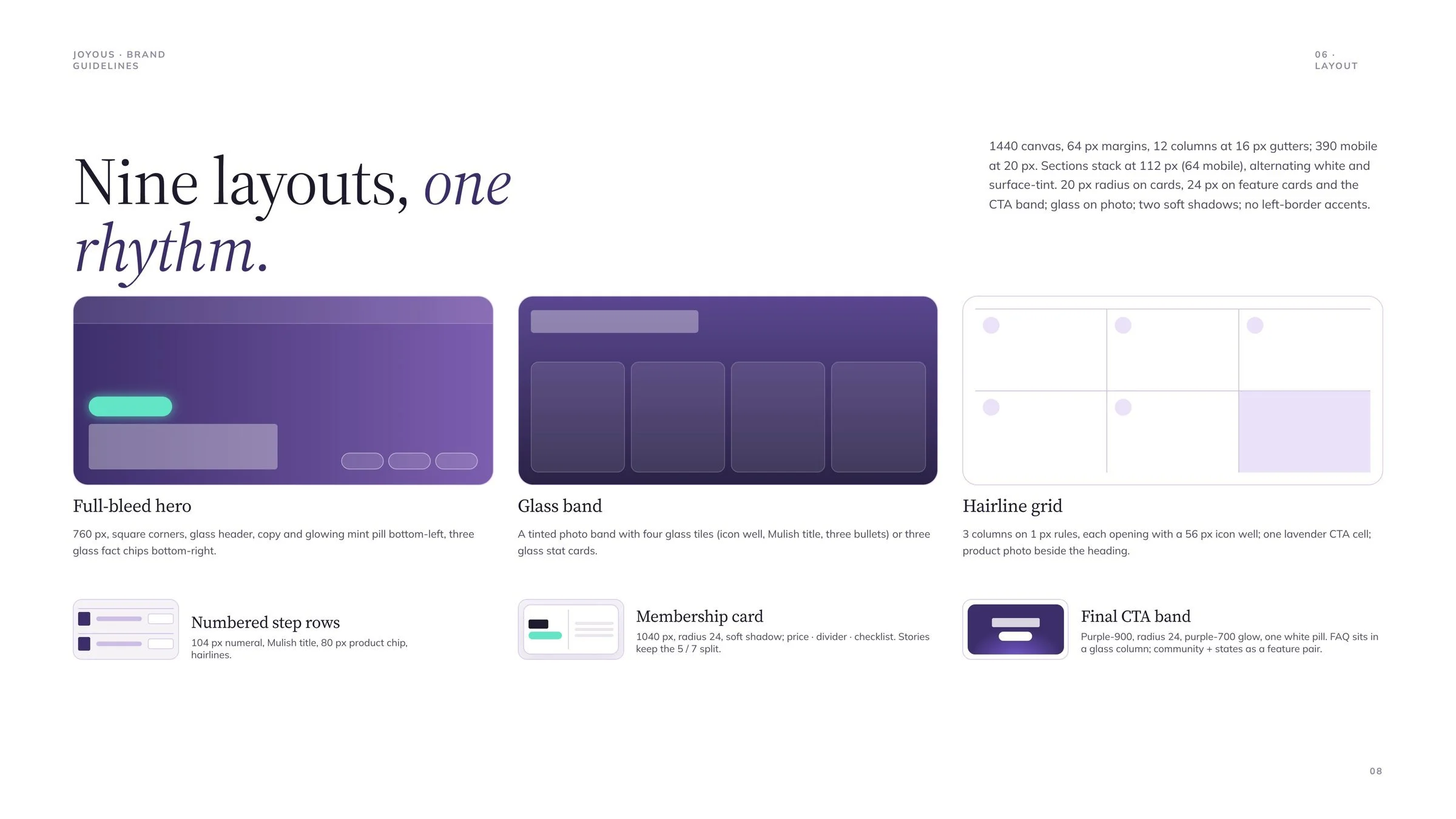
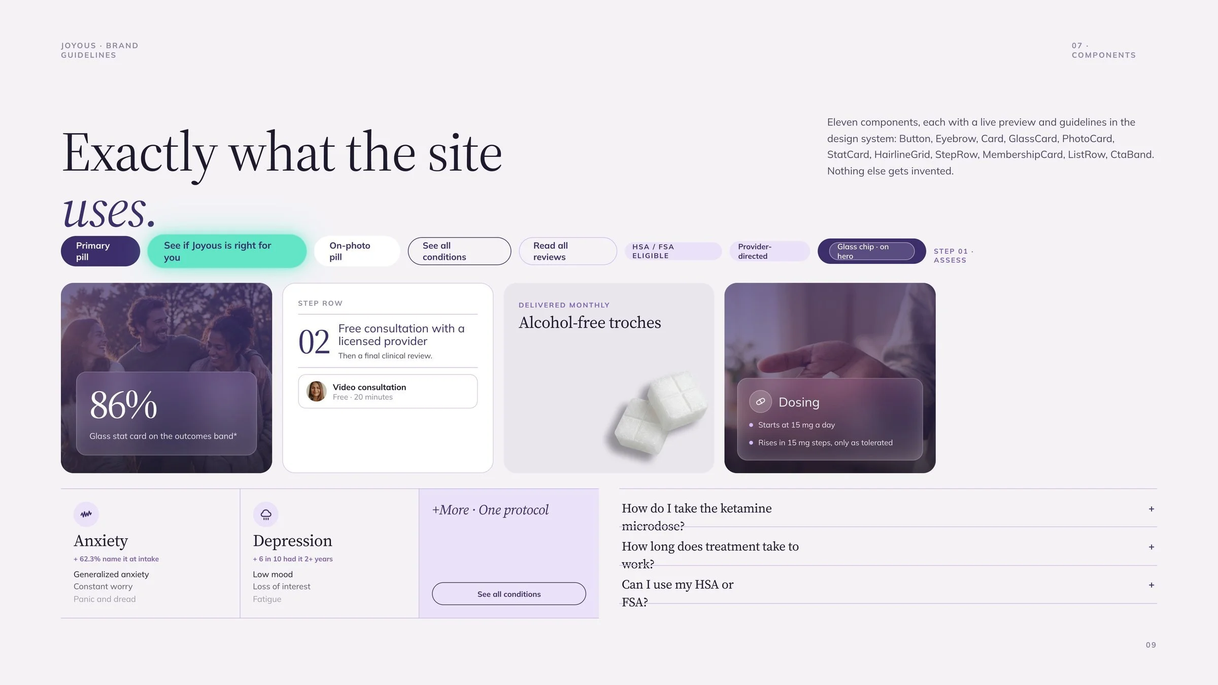
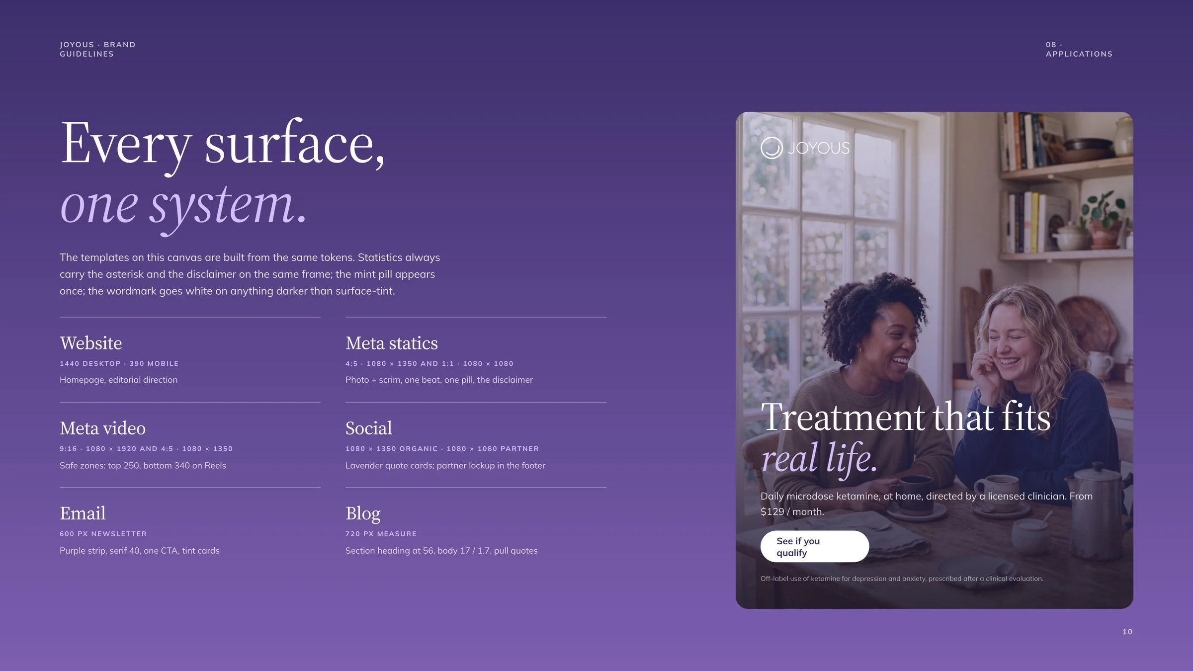
Before refining pages one at a time, I locked the rules into a design system and guidelines deck. White is the ground and Joyous purple is the voice. Headlines are set in Source Serif 4 with one italic beat, body copy in Mulish, and mint is reserved for the call to action. Photography is real light in real rooms, tinted purple. Nine layouts share one rhythm on a 1440px grid, so the same tokens now carry the homepage, Meta ads, social, email and the blog.
EXECUTION
Claude first pass
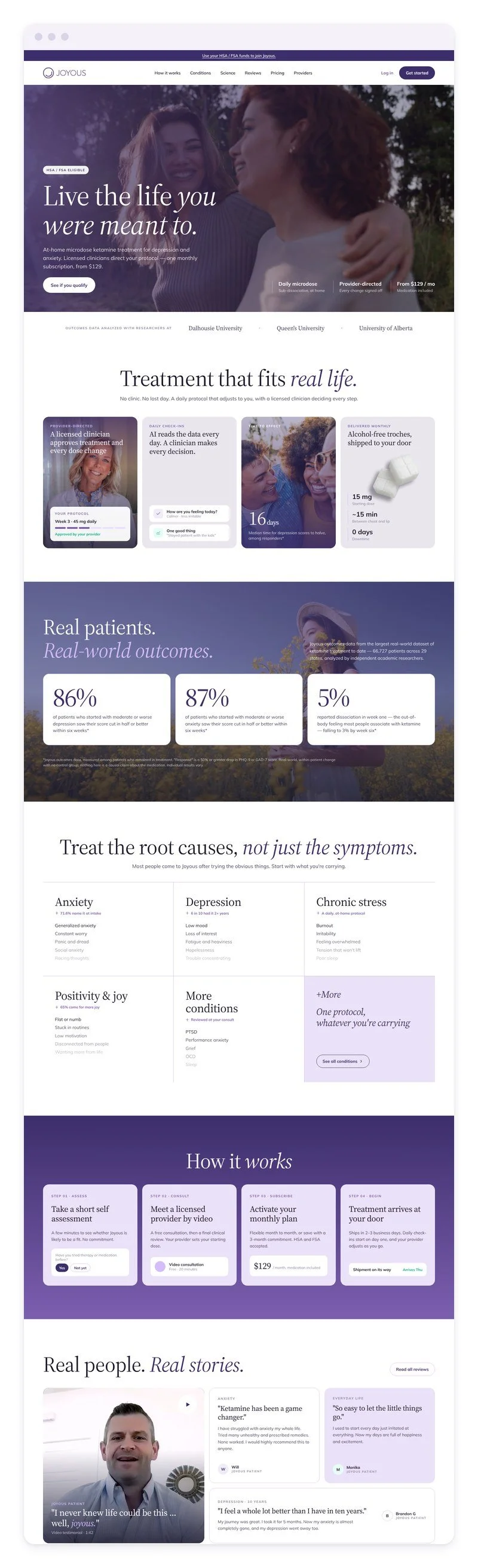
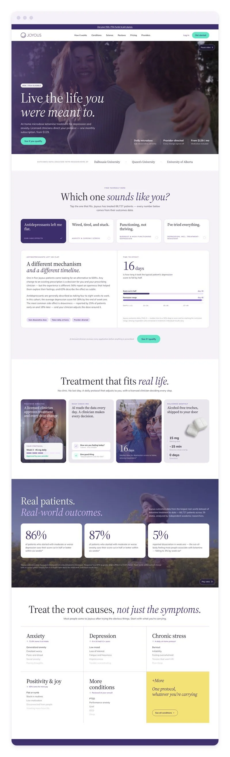
Claude took the first pass. I gave it the old site’s content and my direction, and in one sitting it produced a complete desktop and mobile homepage on a design canvas. It was clean and accurate, but safe: one sans-serif typeface, white cards and a layout close to the original.
My iterations
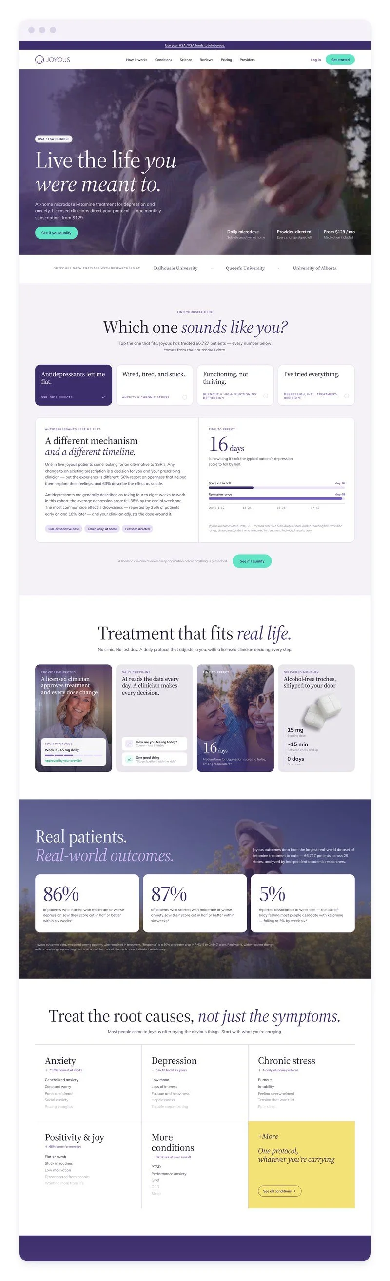
From there I steered it through editorial rounds. Each round added part of the new voice: serif headlines, purple photo overlays, outcome statistics and a “Which one sounds like you?” section. Then we moved from the canvas into a coded, responsive build.
Finishing touches
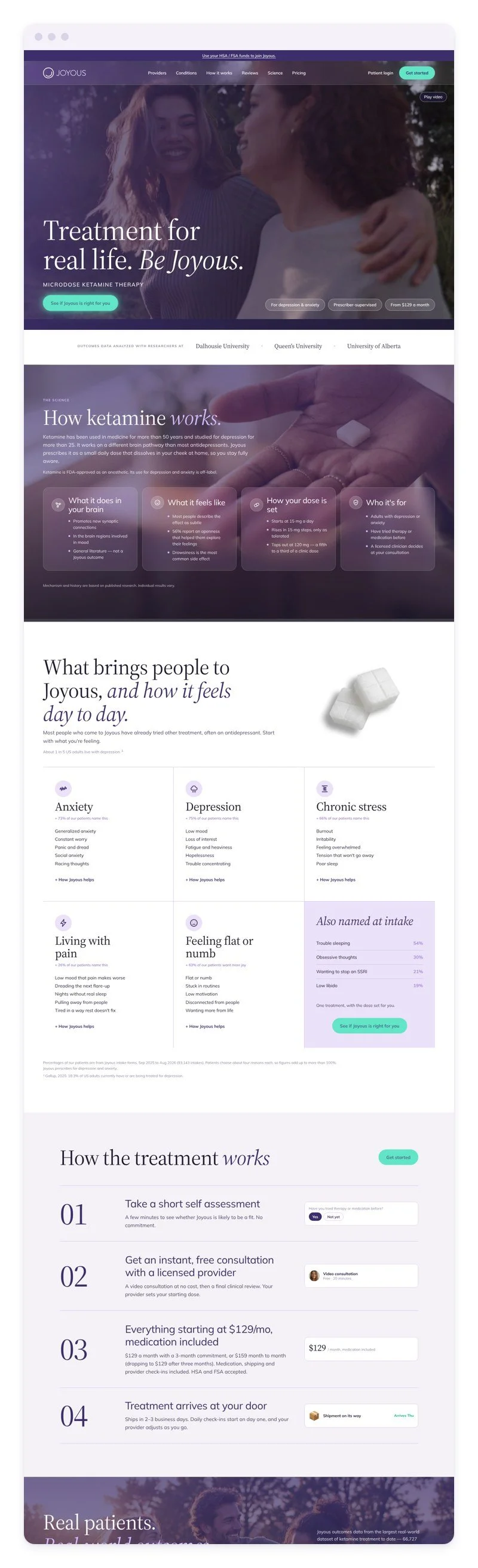
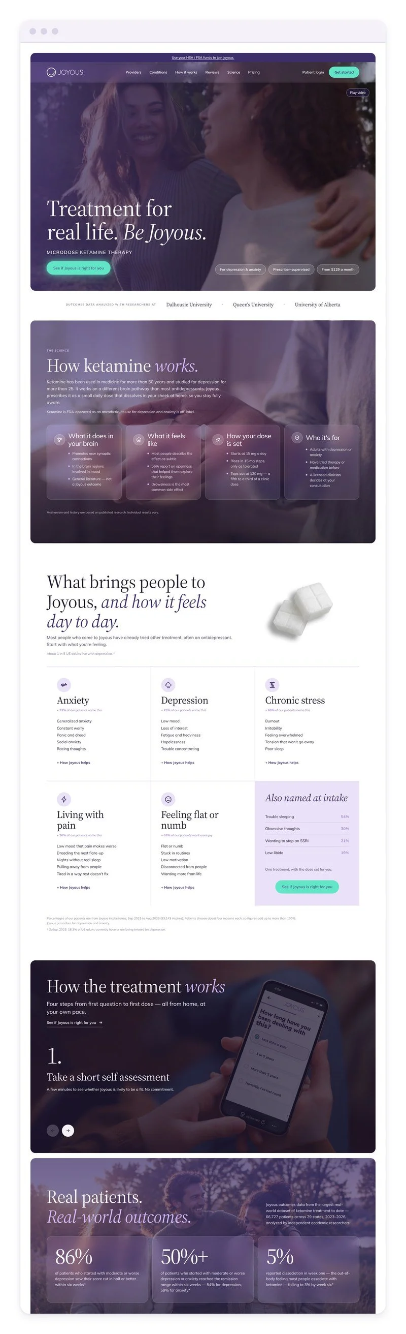
The last stretch was mine. I cut the hero down to a single promise, replaced the treatment cards with four full-bleed numbered photos, set the outcome stats in glass panels and rebalanced the spacing for mobile.
FINAL DESIGN
Where it started
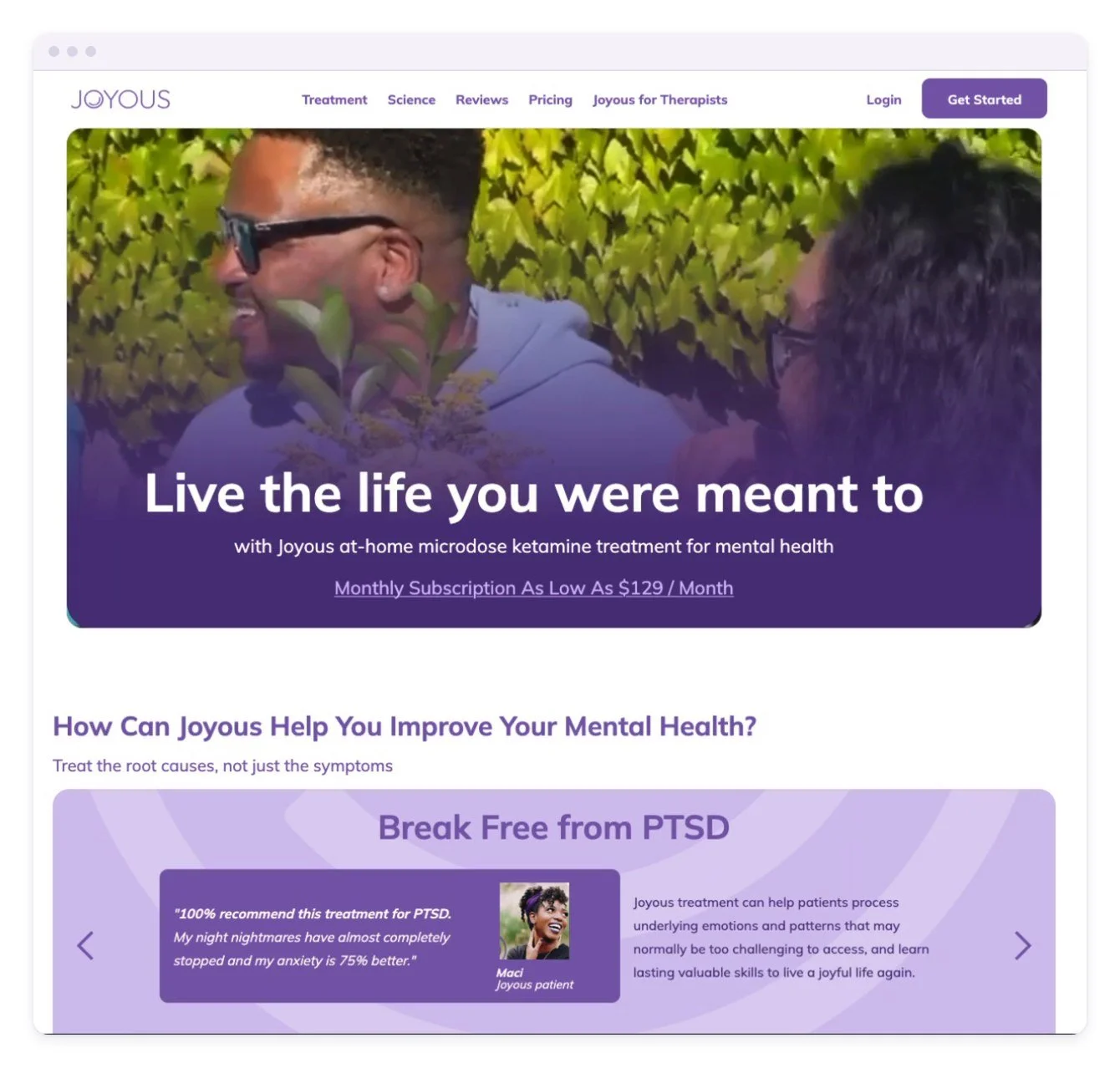
The original homepage said the right things in a generic voice. The redesign keeps the same story and changes the tone. Headlines now sit in Source Serif with one italic beat, full-bleed photography tinted in Joyous purple replaces flat lavender panels, and carousels that hid content became sections you can scan at a glance.
Where I Landed
Outcomes now read as proof, with their sources: 86%, 50%+ and 5%. One mint button asks the same question in every section: “See if Joyous is right for you.” That matters beyond the homepage. Joyous asks people to trust it with their mental health, so the site has to feel credible before anyone reads a word. The new system makes Joyous look like a premium, clinician-led healthcare brand, gives every channel one recognizable look, and lets the team build new pages from tokens and templates instead of starting over.